Category
Web
Background
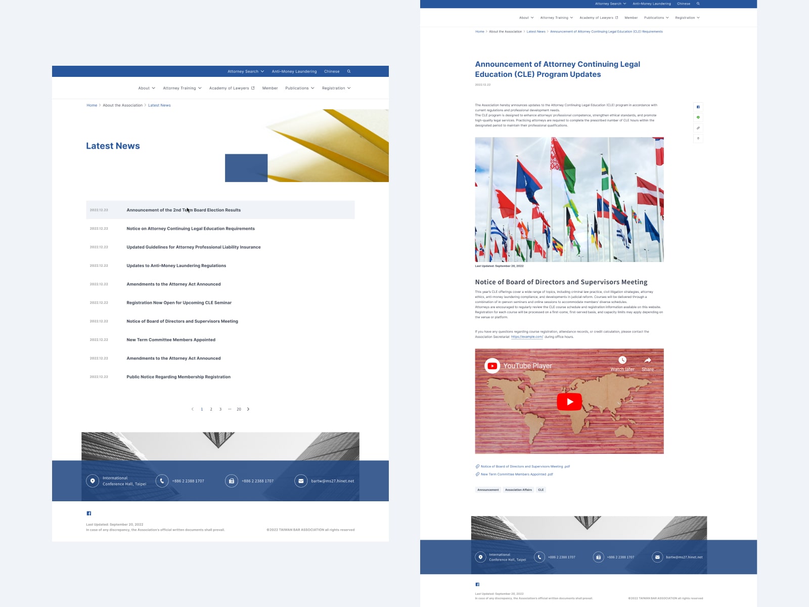
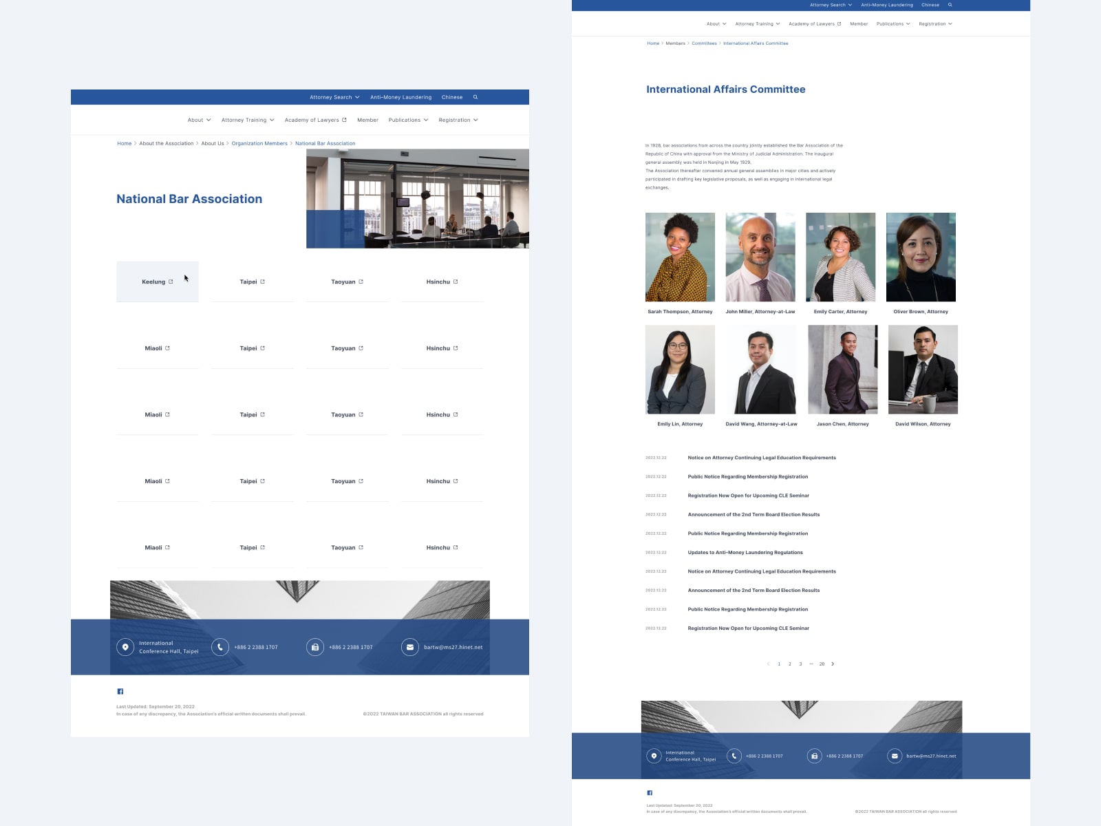
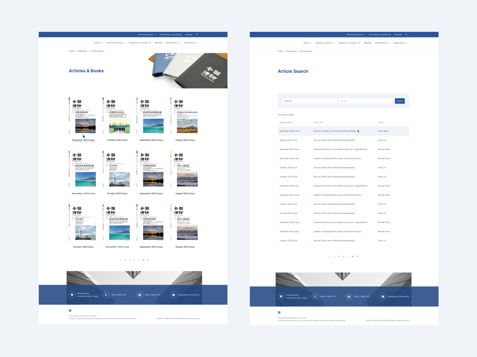
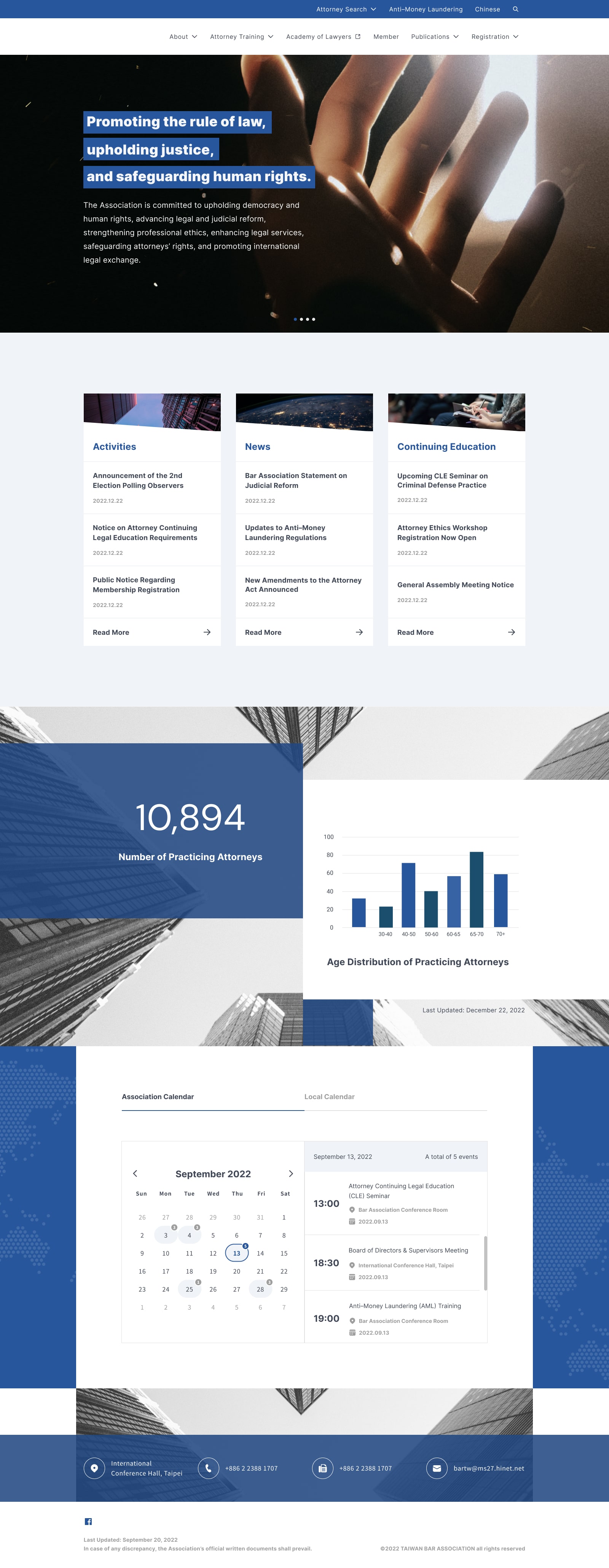
Redesigning the existing website to update its interface and improve information presentation. Enhance professionalism and clarity of information within the existing site structure.
Target Users
Lawyers
Design Focus
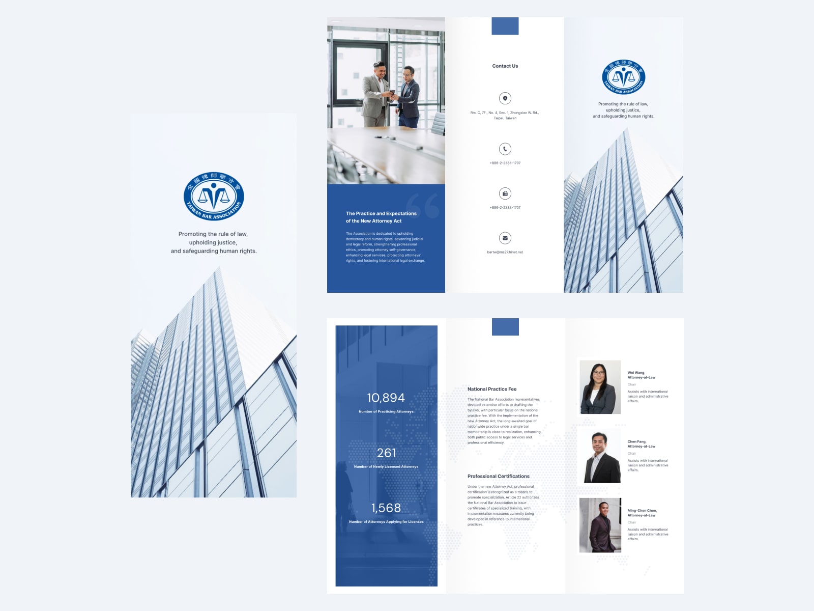
Use rectangular color blocks to create layout hierarchy, with staggered arrangements and full-width sections to maintain stability while adding a sense of visual movement.
Deliverables
Website Design, Component Library.
