Category
Web / Art
Background
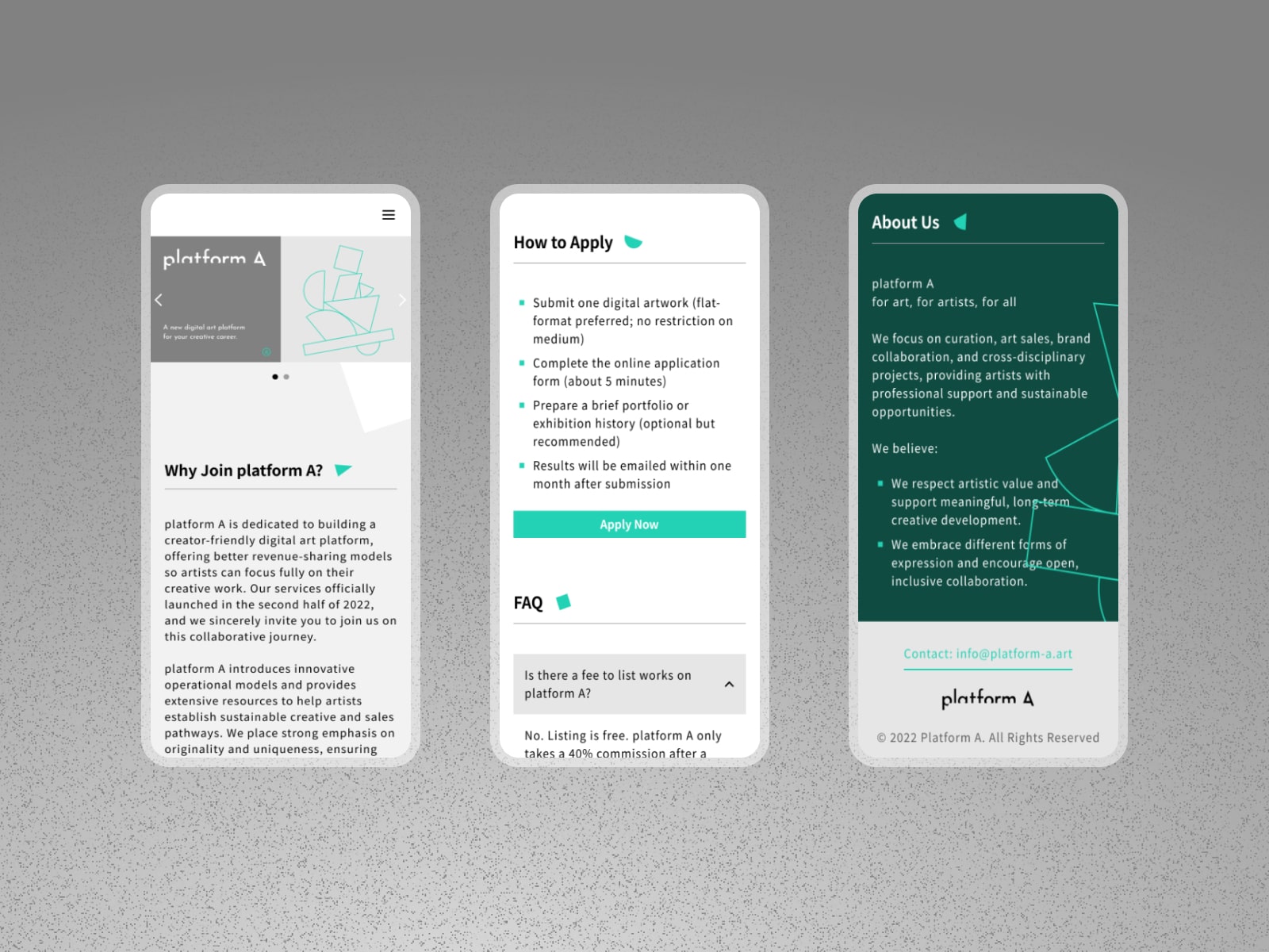
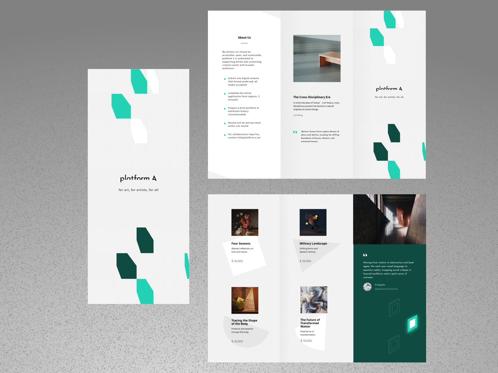
The platform showcases artworks from artists and offers an online “preview on wall” experience, creating a digital alternative to traditional physical galleries.
Target Users
Artists and collectors.
Design Focus
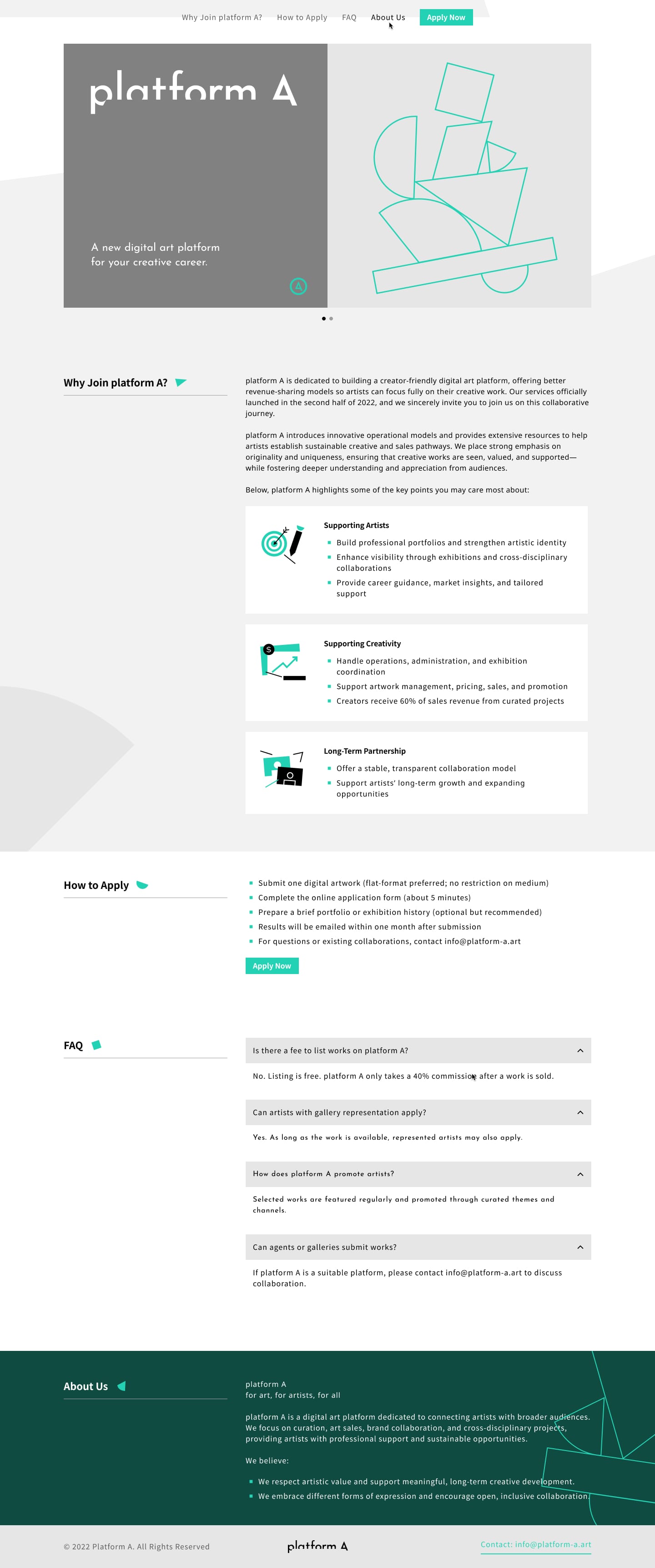
Eye-catching geometric elements placed alongside key headings to add a playful touch within an otherwise clean and structured layout.
Deliverables
Website Design, Component Library.
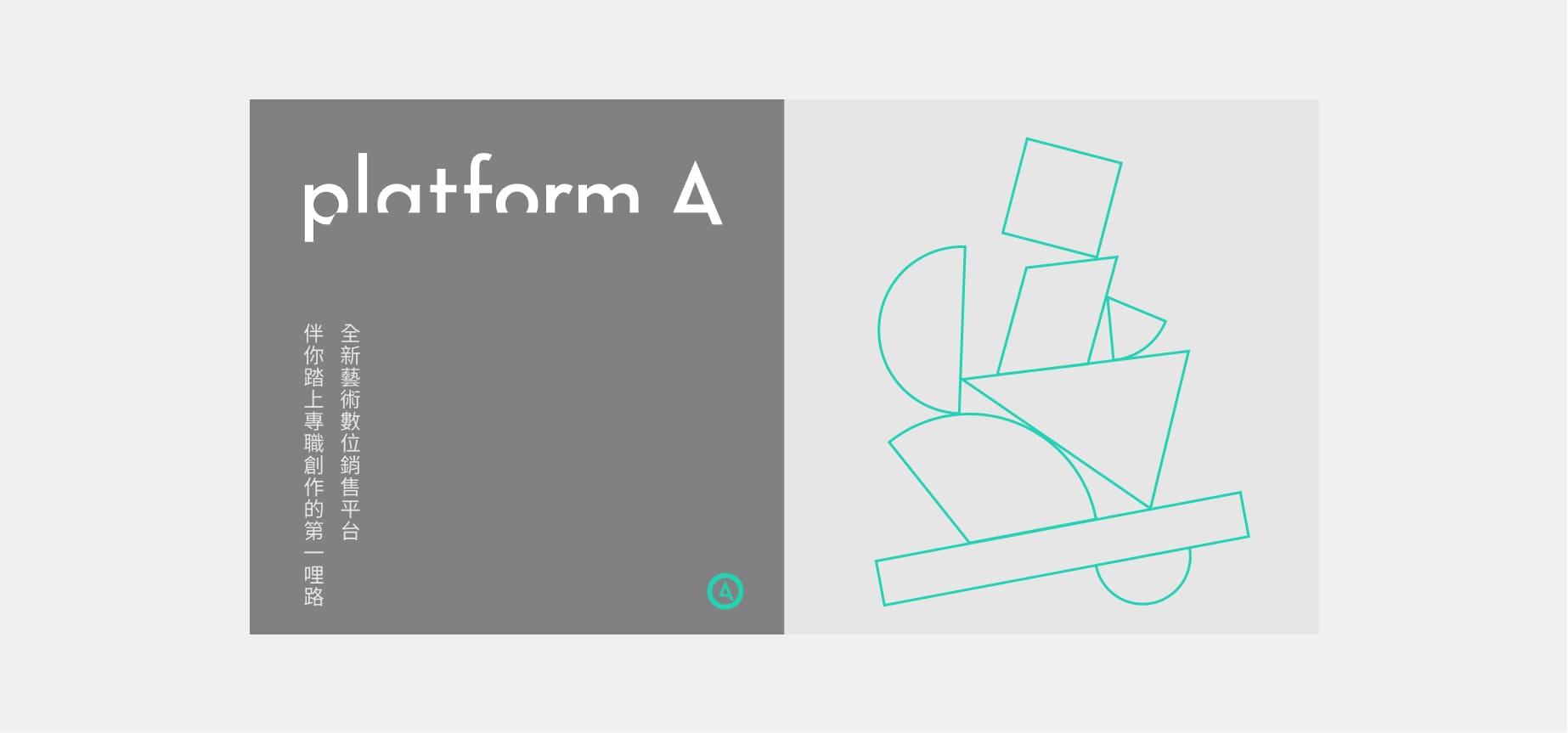
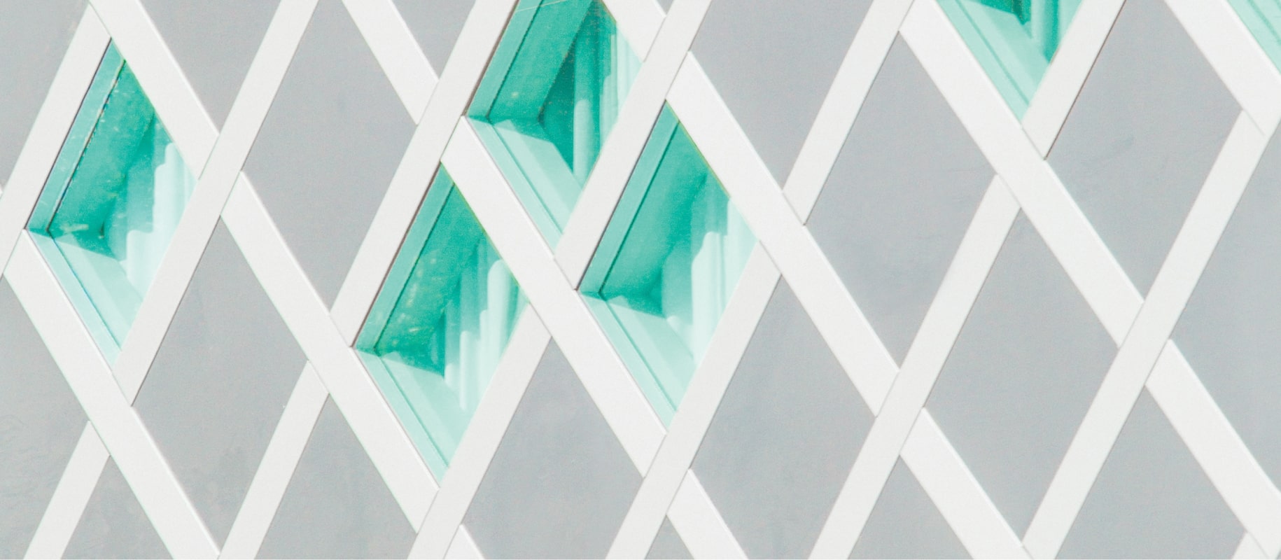
Image: Key visual provided by the client.
