Category
Web / Art
Background
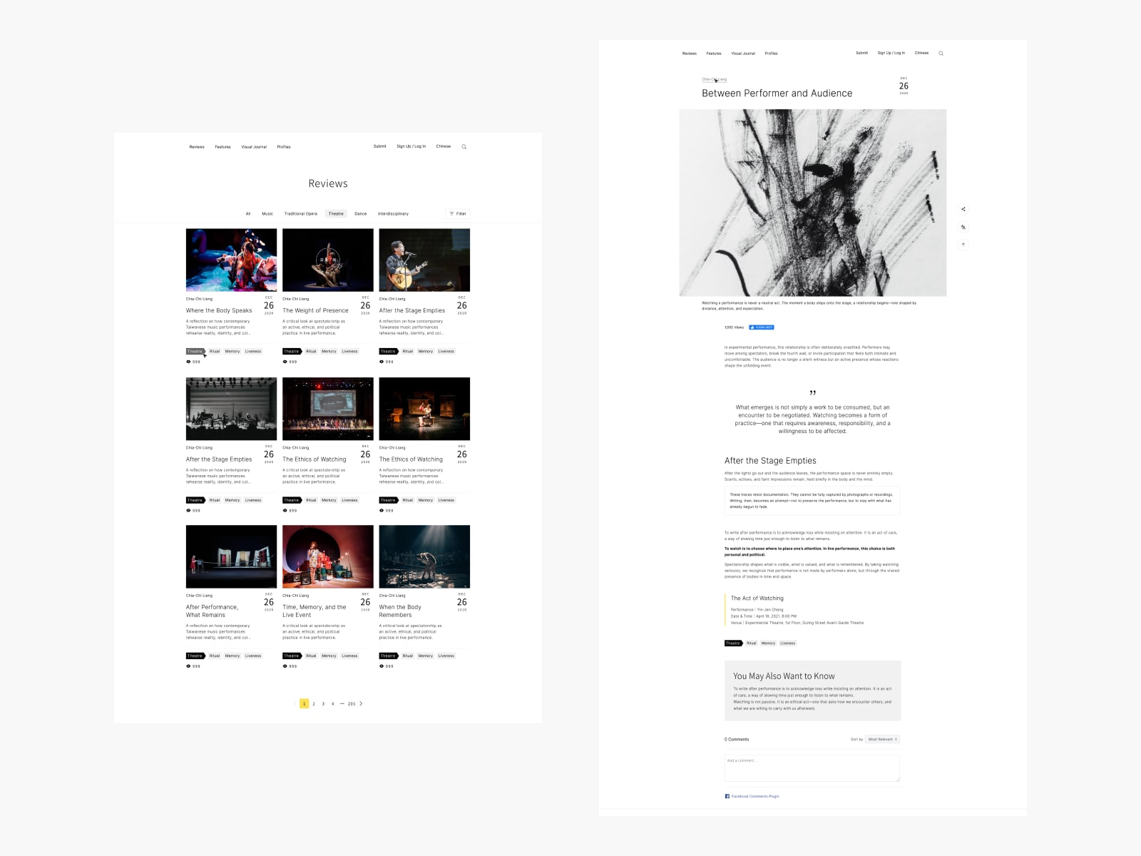
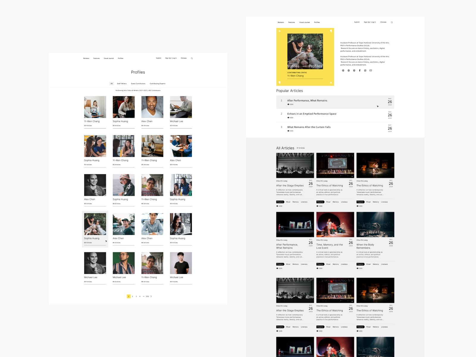
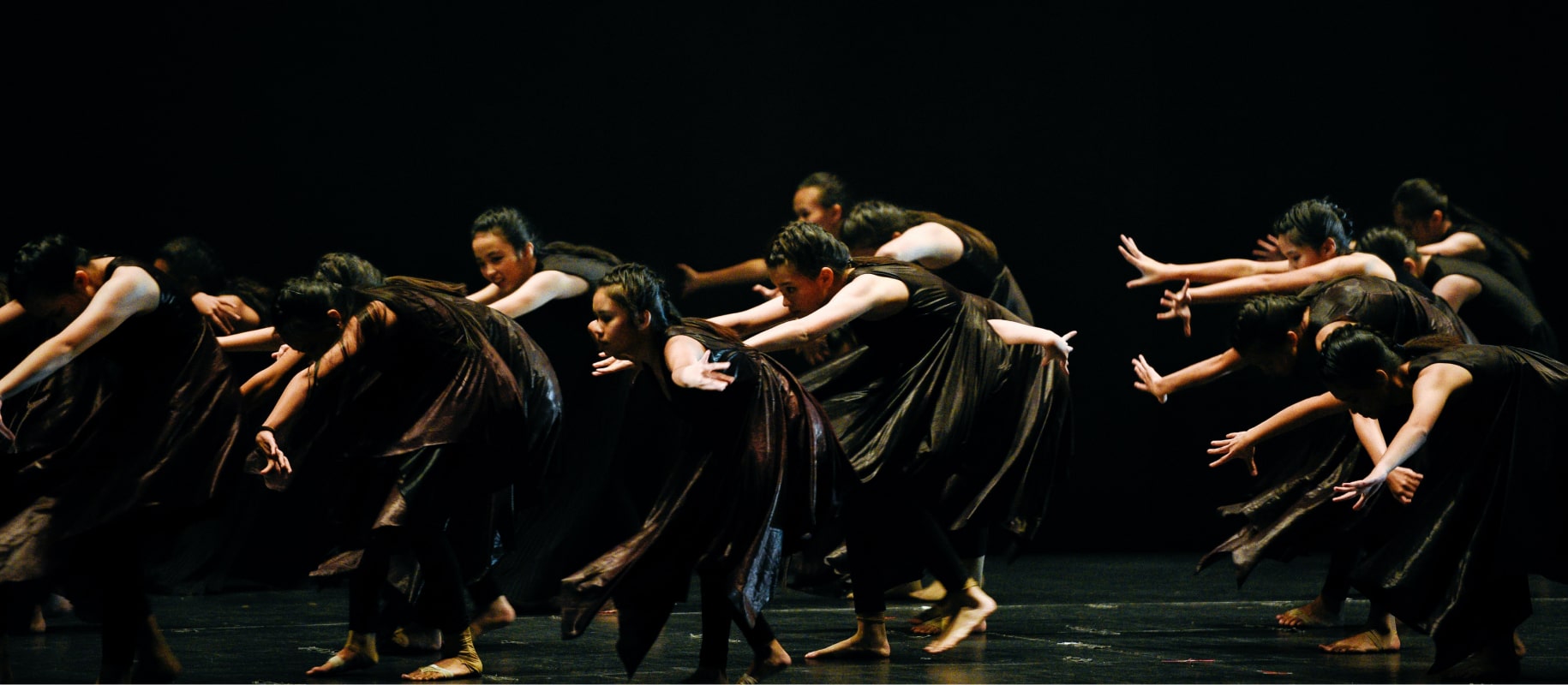
A platform where professionals and arts enthusiasts can share real-time reviews of performing arts works in Taiwan.
Target Users
Performing arts enthusiasts.
Design Focus
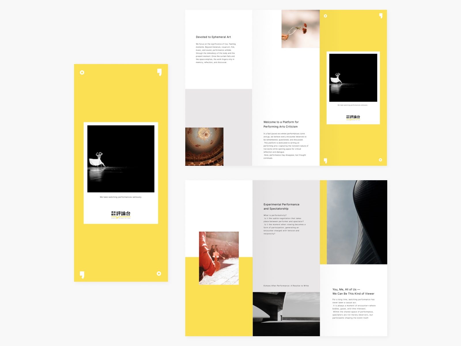
Using a grid system to create a sense of order and consistency. To avoid excessive repetition, variations were introduced by connecting grid elements and adjusting the placement of components.
Deliverables
Website Design, Component Library.
